Guide to Box-Whisker Diagrams
There are many ways to visualize data, from line charts to histograms and pie charts. Visualizing effluent sampling data for I/A systems is cumbersome in most of these formats, as the data sets are typically very large. Box-whisker diagrams present a nice solution by providing in a way that is compact and easy to analyse.
What are Box-Whisker Diagrams?
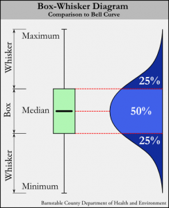
Figure 1. A box-whisker diagram compared to a Bell Curve.
Box-whisker diagrams display differences between populations or sets of data in a compact format that is easy to interpret. Mathematically speaking, box-whisker diagrams are non-parametric, meaning they make no assumptions of the underlying statistical distribution1.
Box-whisker plots are composed of two main parts (figure 1): A box and whiskers. The whiskers are simple: they represent the minimum and maximum values in any particular data set. For example, in the case of an age distribution in a population such as {45, 12, 87, 33, 4, 73, 25}, the minimum value would be 4 and the maximum value would be 87.
The box part of the box-whisker diagram represents the middle 50% of the values of whatever is being measured, with the bottom of the box representing the 25th percentile and the top of the box representing the 75th percentile. The values for the 25th and 75th percentiles may not be numbers directly from the data set – instead they represent what the values would be if the data was continuous (which is to say, in the case of the age distribution in the example above, that each age has at least one person). Compared to a normal distribution (a “bell curve”), the box aligns with the middle portion (it is worth noting that the box does not represent a standard deviation, σ, which would be the middle 68.2% of values).
In the center of the box is a horizontal line which represents the median (middle) value. In the age distribution example {45, 12, 87, 33, 4, 73, 25}, the median would be 33.
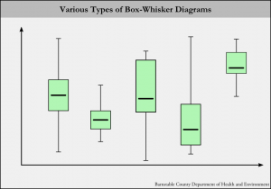
Figure 2. Various types of box-whisker diagrams.
When graphed with real data, box-whisker diagrams can take on many different looks (Figure 2). How the diagram looks depends on the distribution of the underlying data. Exceptionally high and low maximums and minimums can stretch out the whiskers. The second and third columns in figure two are examples of a very low minimum and a very high maximum, respectively.
Depending on the data distribution, the box part can be stretched or compressed. This is called the “spread” and indicates whether the middle 50% of the data is spread out over a large range of values or compressed over a small range of values. The corresponding “bell curves” for a compressed box diagram would have a sharper and higher peak, while a stretched-out box diagram would have a rounder and lower peak.
The box can also lie at various positions between the whiskers. This is called the “skewness”. A diagram such as the fourth column in figure 2 is a good example of a “skewed” data set, where the box is close to the minimum value.
How can Box-Whisker Diagrams be used to Analyze I/A System Performance?
Box-whisker diagrams stand out as an ideal way to display differences between the performance of individual I/A (Innovative/Alternative) septic systems “at a glance”. Figure 3 shows just such a diagram.
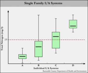
Figure 3. Examples of box-whisker diagrams for I/A septic systems.
In figure 3, the “x” axis represents individual I/A systems, while the “y” axis plots total nitrogen values in milligrams per liter. In the state of Massachusetts, most I/A systems are held to a 19 g/ml effluent total nitrogen standard (shown by the dotted red line).
System “A” is an example of a well-performing system. All total nitrogen values fall below the 19 mg/l standard, and the box is compressed, indicating the middle 50% of values fall in a small range. In terms of I/A systems, a compressed box indicates consistent performance.
System “B” is an example of a system that usually performs well. Most total nitrogen values fall below 19 mg/l, but there may have been a high result at some point. Typically a far-outlying maximum whisker indicates a system startup sample. Also note that the box is a bit stretched, indicating that this system may not be performing very consistently.
System “C” represents on that is “on the cusp” of being a well-performing system. The box is a bit stretched and the median is falling above 19 mg/l.
System “D” could be called a “consistently poorly-performing system”. While the box and whiskers are nice an compact, all results are well over the 19 mg/l standard.
By considering all parts of the box-whisker diagrams for I/A system performance (median, spread, skewness), one can get a pretty good idea of how well a system is performing. The caveat is that the nitrogen output of an I/A system is entirely dependent on the nitrogen input. To truly assess performance, an effort must be made to determine how much nitrogen is coming into the system (which is an entire topic on it’s own).